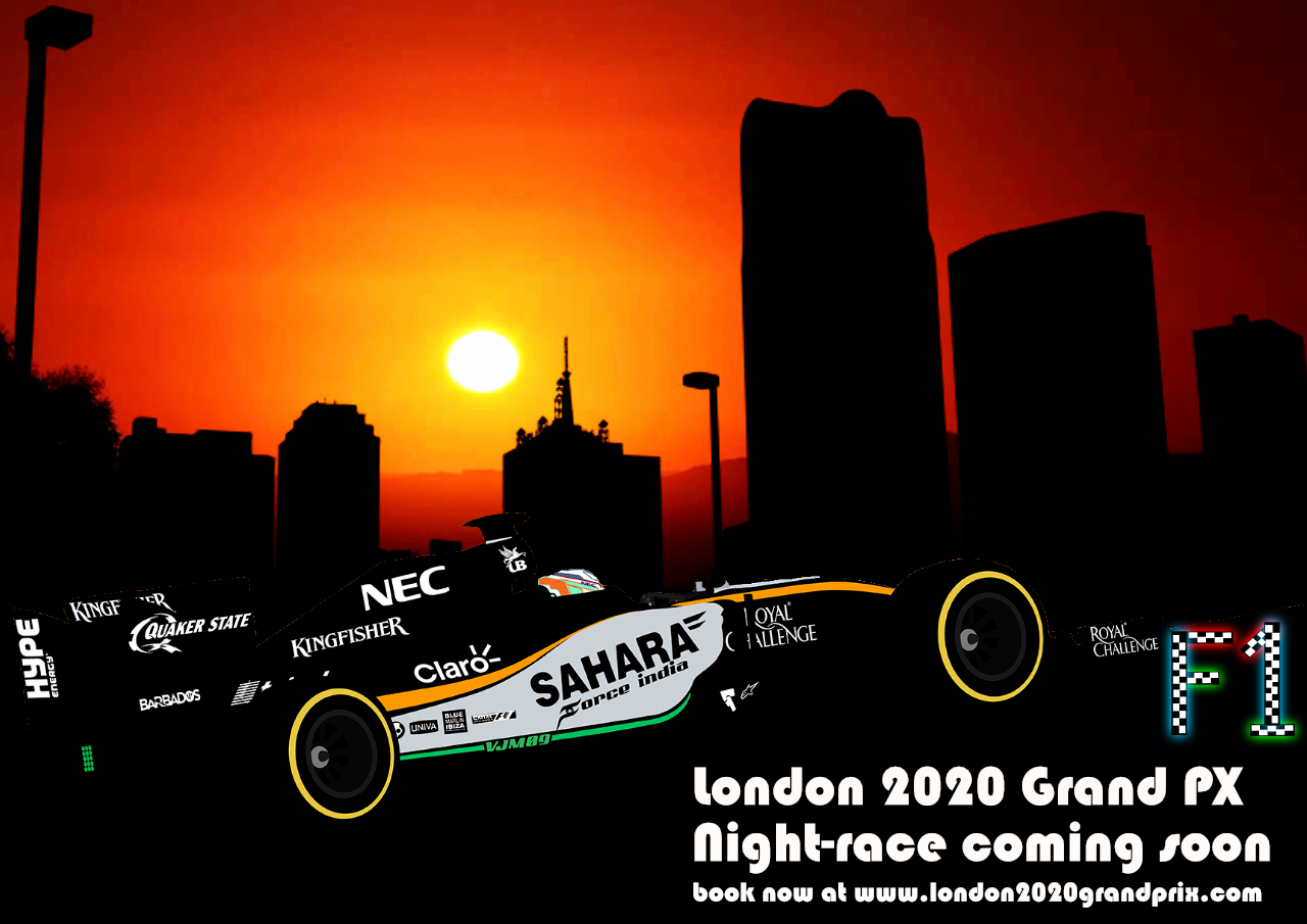
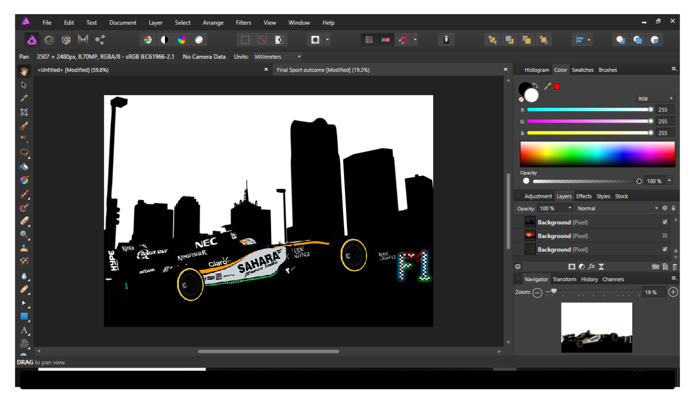
When Designing the Sports Poster it was important that I used aspects of the Golden Circle and applied it to the creation of my poster. For my poster I wanted to promote a F1 event for a nigh-time race that would be held in London. This is because there has been a lot of speculation on if a race in London is going to take place. One of the first steps I took to create this image was to design an F1 car. It was key that it was side on to create the message to the audience that its moving. I then needed to apply a city background to make it represent what I wanted to create. The city background needed to black to represent nigh-time. When creation this I had to consider were the sunset would go and large the city background should be. I also created an F1 logo that makes the image stand out more. It also allows the viewer to clearly see what this is advertising. I increased the contrast of the background the buildings sharper and stand out from the cars colours. After I applied the city background I added in the sunset background. I had to reduce the brightness for this as it was not dark enough. This allowed the orange colour to stand out. The positioning of the Sun was very important. It needed to be in the centre of the composition. I also added text to the image to let the audience know when this event is taking place and how they can find out more information about it. The Sun is the main focus of this image is its central to the composition.
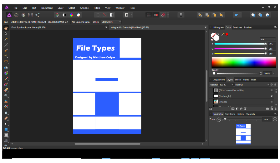
When Designing the Info graphic Poster I needed to plan were I was going to include the file type logos. I made sure that there was space provided for the text as well as the file types. I wanted the colour scheme to be simple and allow the user to have a clear understanding of each of the file types. I did this by creating many layers so that the file types could clearly fit in and that the colours don't class with the text. I needed to make sure that it was clear what each of the file types were presented clearly. I also included an image of a wide range of different file types. I also wanted to include an image that would demonstrate what the best file type is. This is why I have included a computer image that explains what file types are the best and why. I decided to include seven images in the main design. I also wanted the description in the centre. This is the final design of the Info graphic Poster. I have included a short description about the different file types. The colour scheme of blue as well as white work effectively with my design. When doing research on different info graphic poster they all include main images. However, for this task it was important to tell the viewers the importance of the different file types and the impact that it has.
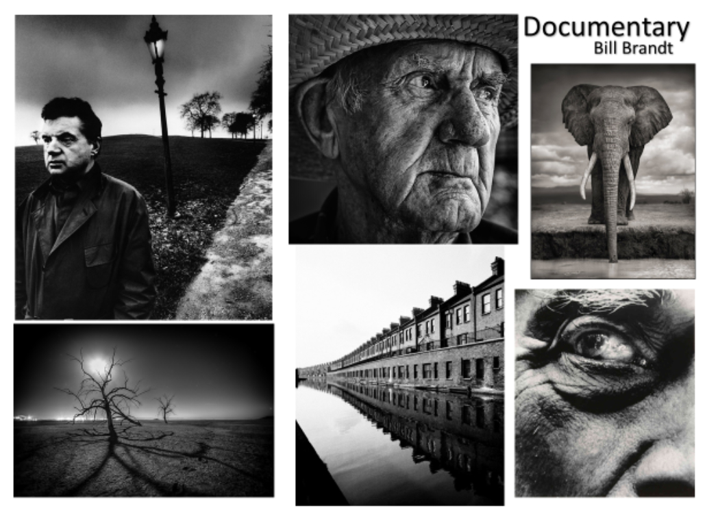
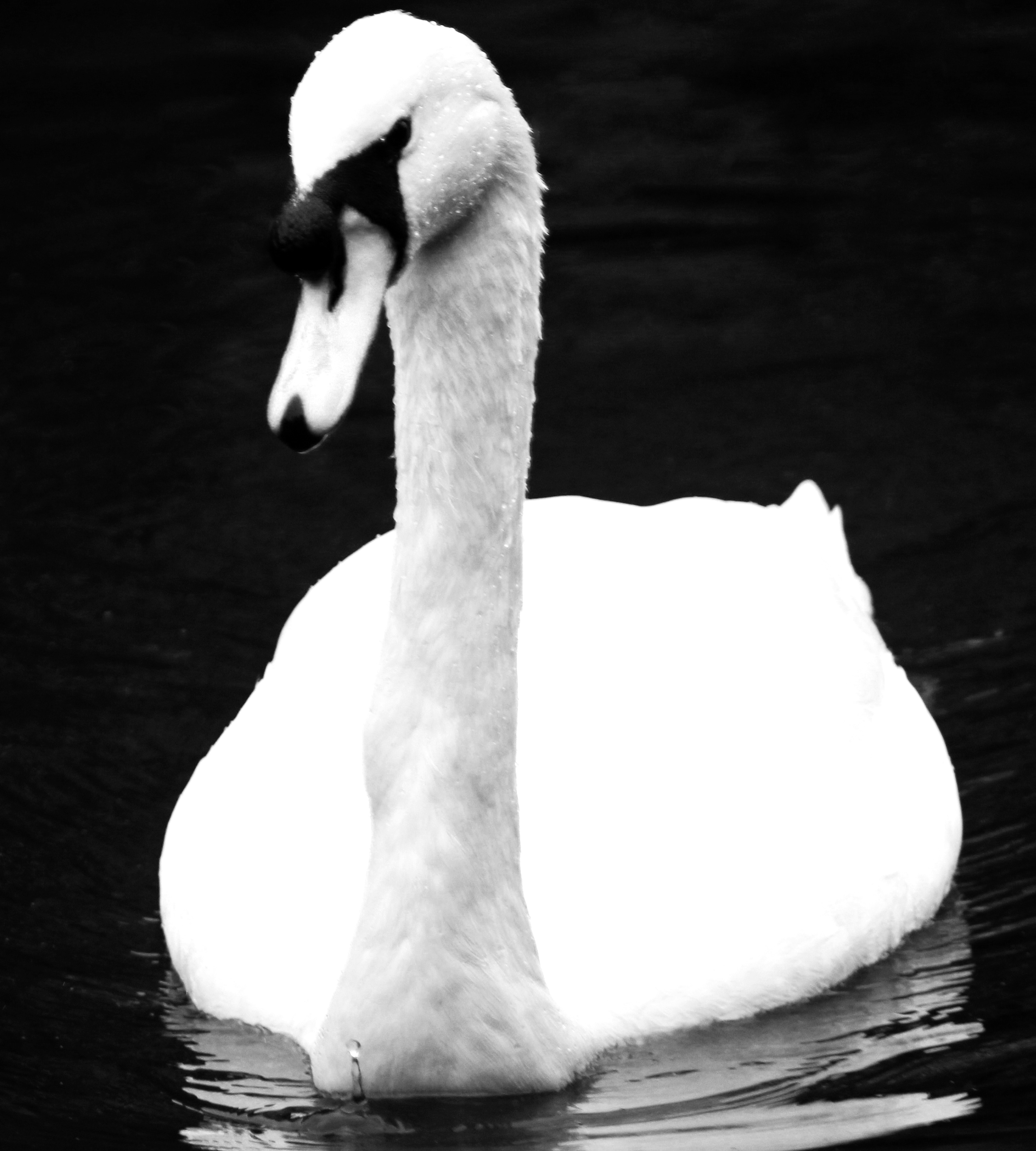
It's very important that I research a photo that I can express my creative skills with using black and white photography. This is why I have decided to choose Bill Brant. He is very effective at using black and white images and successful at creating a high contrast and a large depth of field in his image. However, he doesn’t only do that. In most of his work he is able to create different sized objects and people. He is able to achieve this by taking his pictures from a low to high camera angle. By doing this it makes it look like the object/ person is actually bigger than what it might look like. However, I have decided to go down the root of how he uses black and white images and how effective he is at creating a particle meaning in his work.
When creating the game, it is very important that we are able to research the correct information. As its an educational game the facts and figures need to be spot on. For example, for the county of France. It is very important that we are able to identify the correct words and phrases that they would use. As we are only creating one level for the game, we have only focused on the country of France. For part of my research, I have had to research fames, venues and objects that are related to France. Some examples of educational game are vocab express, BBC Bitesize. As I am the designer of the group its important that I consider all of these factors in the mind map. Target Audience: I need to make sure that the icons that I create for the game are suitable for the age range of 11–15-year-olds. They need to be simple so that its clear what French Objects they need to identify. Language Game: As the game’s first Level is French I need to make sure that I include French related objects that are part of their culture. For example, the Eifel Tower is a very popular tourist destination in France. Objects: Throughout the game the main character Billy collects objects throughout the game which he stores in his Backpack. The user is then able to view what objects they have collected and what they still need to collect. This makes the user want to play the game again in order to collect all of the objects. Culture: Its important that the user is able to understand the culture that they are playing in. As the user is exploring the country of France and learning the language its able to take onboard its surroundings. Therefore, as the Designer I need to make sure that the user is able to understand the culture through the objects that I create for the game. School Trip: Its important the user is able to understand the narrative and how the story flows. Therefore, when creating the objects there needs to be school equipment. I am the designer of this group and it’s my responsibility to create them. These are some of the objects that I have created for Capture the World. I have designed objects that are related to the France and their culture. It’s important that the user can understand what each county is known for. For example, in France its known for the Eifel Tower. I have also included the French Flag as this will help the user identify the county.
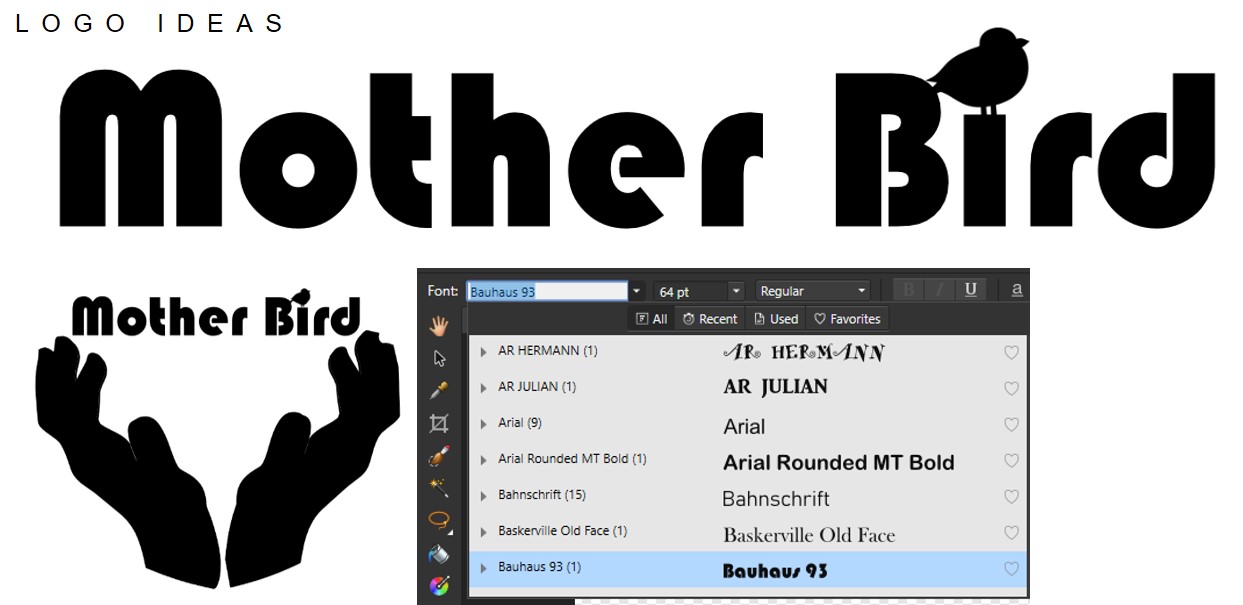
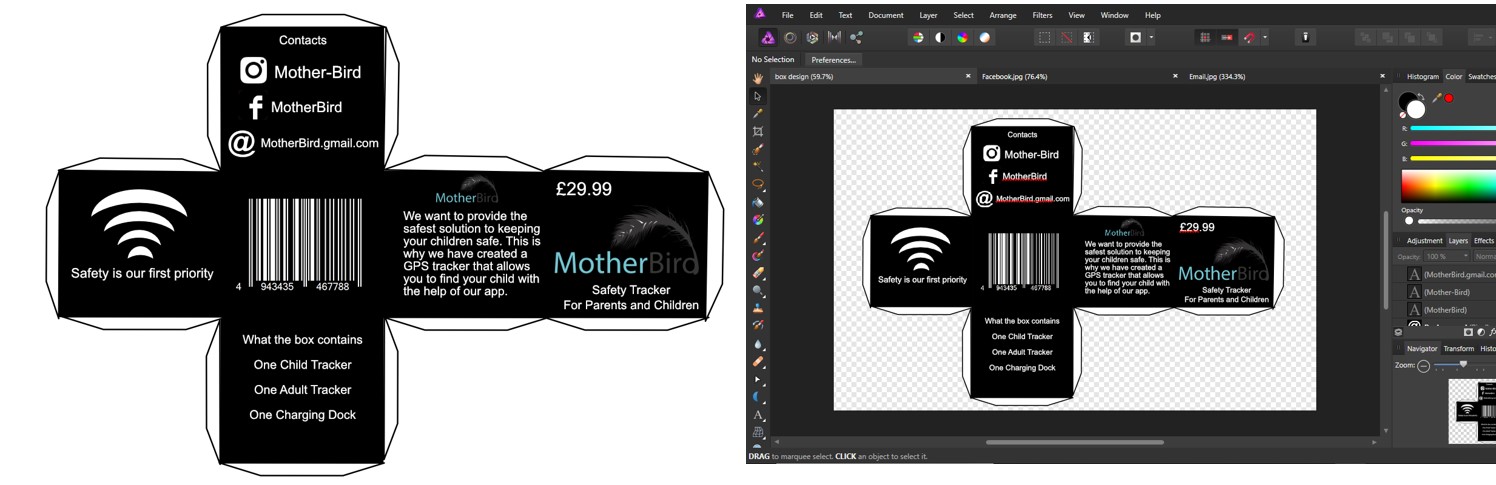
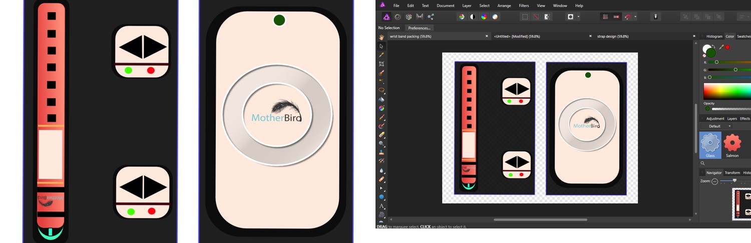
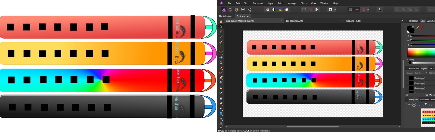
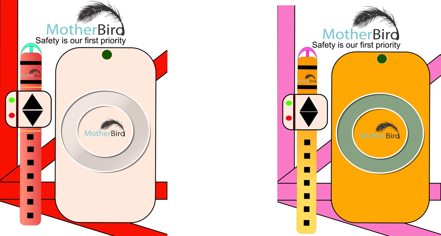
We aim to create a helpful and useful device that will allow parents to track their children and know where they are. The wristband will have a face recognise that will follow the children. We aim to target 5–10-year-olds. We will need to consider the customisation element of the wrist band so that its suitable for both boys and girls. As for the consumers who is going to buy the safety tacker it’s important that the parents are able to afford the device and that it’s suitable for the children. It’s important that the wrist band design is simple as there needs to be elements of customization as well as all of the features and buttons that the wrist band needs. However, each of the wrist straps have different prices. This will then affect the overall cost of the entire price of the wrist band and the set together. For the adult/parent design of the wrist band there will be two different strap designs that they can choose from. This will be a simple black or white design. It’s important that the adult tracker is smart and professional as it needs to suit the target audience of adults. For the adult strap the Milanese loop is the best design that is classier and more professional. Depending on how expensive the tracker is, and the price will determine how many different customable designs we will create. For now, we will create four different designs for the straps. These are the logo ideas that I came up with. I decided to use a simple font called Bauhour 93. The main reason why I decided to choose this text is because of the curved design of the words. The Mother Bird device is easy to connect and its functionality. With the shape of the words its easy to connect and this represented by the design of the words. I also decided to include a bird on top the top. I think it is a very effective aspect of the logo that gives it more finesse to the design of the logo. I decided to go with a simple black and white colour scheme to the design of the logo as it creates the poisoner that the bird is a shadow. This then creates an interpretation for the audience. Personal I believe that the first logo that I created is a lot more suitable for the meaning of the brand. Its less busy and is easier to adapt. This is the design for the packaging that I have created. I have made sure to include lots of important information on the box so that the target audience is informed all of the information that they need. It’s important that we represent the brand and make it stand out from other wrist band designs. The black squares is where the buckle goes through. I decided to create four different designs. The black design is a more neutral colour that can suits both Men and Women. However, the pink design is more suitable for Women. The bright orange colour is can be worn by both. The orange design also creates a summer vibe. The multi bright and colourful design is to stand out and could be aiming at the younger demographic of bellow 6-years-old.
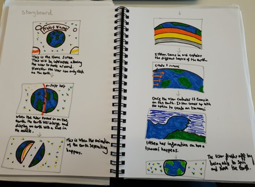
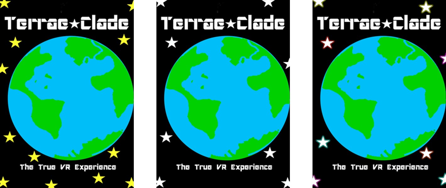
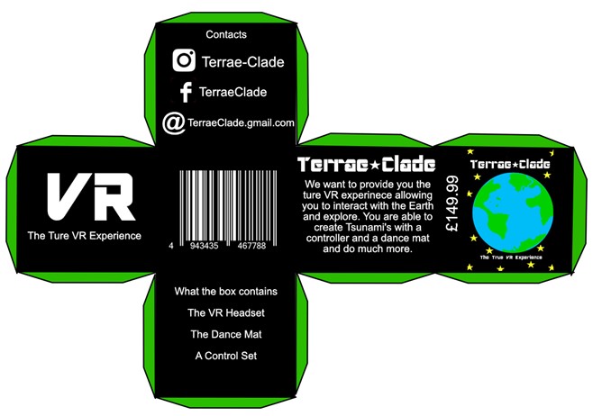
Our group has decided to choose the school trip demographic that we are going to create the interactive media project for. The way in which we are going to make the interactive globe suitable for school children is by incorporating geographical information as well as the ability to cause a tsunami or an earthquake. We will create a dance mat and controllers that will allow the user to do this. This is the storyboard that I have created for the Interactive Project. The homepage works by allowing the user to move around and look at the Earth from different angles. The user can then slice the earth in half by using a controller. The Earth then separates and teaches the user about the different layers of the Earth. The user can also create a tsunami by using the device. The animation will happen and afterwards it will explain how a Tsunami happens. Once the user has read through the information they are taken to a different screen where they can move around the Earth. This shows the design process and development that I went through to create the first poster design. When designing the poster, I wanted to have a simple colour scheme as well as making it clear for the target audience what the product is about. From the feedback received from my group they suggested reducing the number of colours and the number of stars. I decided to make the stars white and in the final design add a glow effect to them. This is the final poster design that I created for Terrae Clade. There are many changes that I made from the original poster. I have included Alice’s logo which me decided to go for. The description of what Terrae Clade tells the audience the meaning of the name. There were also some words that I had to create due to development of the game. For example, I had to delete the word VR and replace it with, The True Experience. I then included a small description of what the game is about so the audience can get a better understanding of what the game is about. This a packing net that I have created for the Terrae Clade. When creating the packing I had to consider how the target audience would be able to identify what the product is about. This is why I have included a description on the box as well as a bullet point list of what's inside. I decided to include a simple colour scheme of white, black, and green.