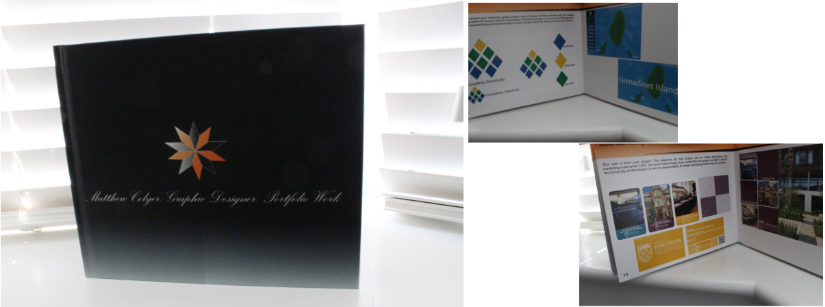
For this individual project a printed and online portfolio book are required for this assignment. The professional portfolio printed and digital version include the final outcomes for projects that I have undertaken as well as development of sketches and ideas. The work that I have mainly included for this assignment is projects that I have undertaken whilst at University throughout my 3 years. This assignment can be shown to potential employers that are interested in the wok that I produce. It was important that this assignment represented me and included evidence of self-branding that is shown in both my portfolio and book. The importance of creating a brand identity needs to be shown in all my work to potential employers. It was my responsibility to choose the printer provided for this project as well as the content and structure of the book. I decided to include a contents page of the projects that were cover in the book.
For this module assignment I needed to create an online and printed portfolio. This was created on InDesign. I had to consider the file sizes of the images for both the online and printed portfolio. For the printed portfolio I first had to adjust my images to 300 dpi to ensure the image was suitable for printing. I had to do this for all of my images for the printed portfolio. As for the online portfolio I needed to consider the fuctionally and include buttons and forms allowing the user to navigate to other pages. I also needed to set the document to an interactive pdf file in InDesign to allow the navigation buttons and links to work. For the online portfolio I needed to reduce the file size of the images to make it more user friendly for online. I did this by reducing the dpi and made small adjustments to the overall file size.
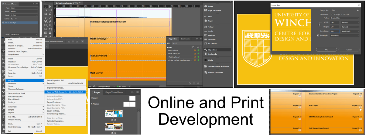
For this module assignment I needed to produce a printed portfolio. The design of the printed portfolio needed to show evidence of self branding and project work. Examples of the printed portfolio are shown bellow. The printed portfolio provider that I used to create this was Blurb. I was able to use InDesign to design this printed portfolio and used three main colours for evidence of branding. I took inspiration from my cv document to create the pages and included a gradient effect throughout.
For this client project I wanted to learn more about formatting and layouts in order to great promotional material for advertising and more projects in the future. It was my responsibility to use the branding to create promotional material that could be used for the launch of CEDI’s new facilities. This project was related to the University of Winchester and was to create the marketing material and for CEDI’s new 3D Printing Hub, Networking Events and Training Hub. These had to be presented to market the two hubs and networking events via branded flyers and posters as well as other formats of your choice. These creations are ongoing marketing material and information for the brochures need to link with the CEDI website. This will be designed to suit your audience for the category of professionalism with a strong look and feel to tie in with the University of Winchester branding.
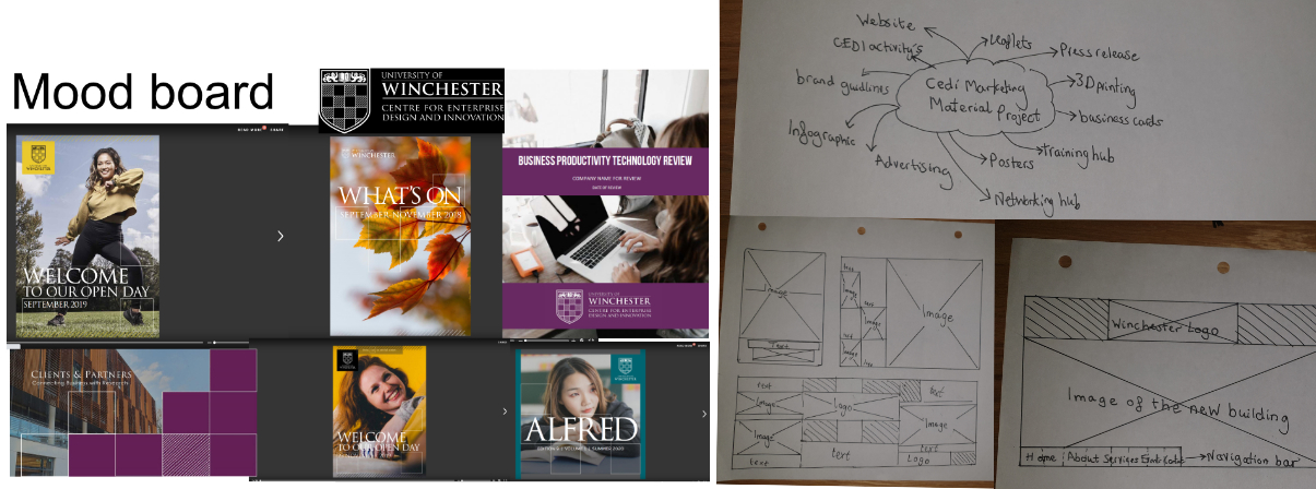
It was important to look very closely at the university of Winchester brand guidelines and get a better understanding of the content and formatting that they produce. This is because the work that I had to produce for this project needed to fit in with their guidelines. I first started off by doing some sketches for the advertising material and a mood board and a mind map. I also created a mood board to get a better understanding of how I can use the University of Winchester brand guidelines to create marketing material. The grid layout was shown a lot as well as the colours of yellow, purple and a dark green type of colour. When doing the sketches for this project I had to consider the positioning of the image and how the text would flow allowing the user to have a good user experience of the CEDI website.
The cedi marketing material had already provided me with the logo that I should use for this project. This had to follow the University of Winchester brand guidelines that were alongside this. Despite this I was still able to use the colours that they provided and see how it fitted with the logo with white text and black text. The colours that I could choose from for this project are shown below. These colours formed the main base for this project for the advertising materials for the cedi client project.

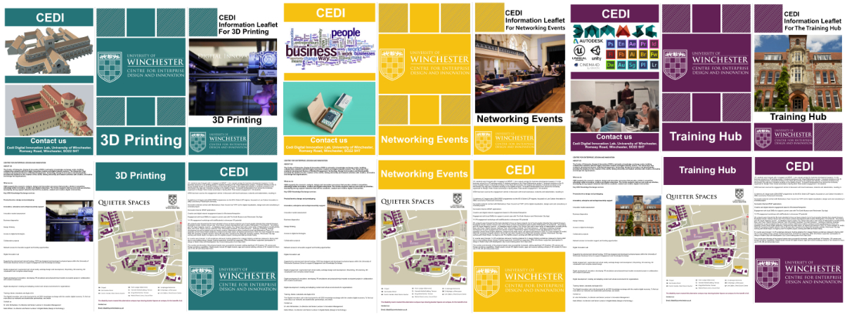
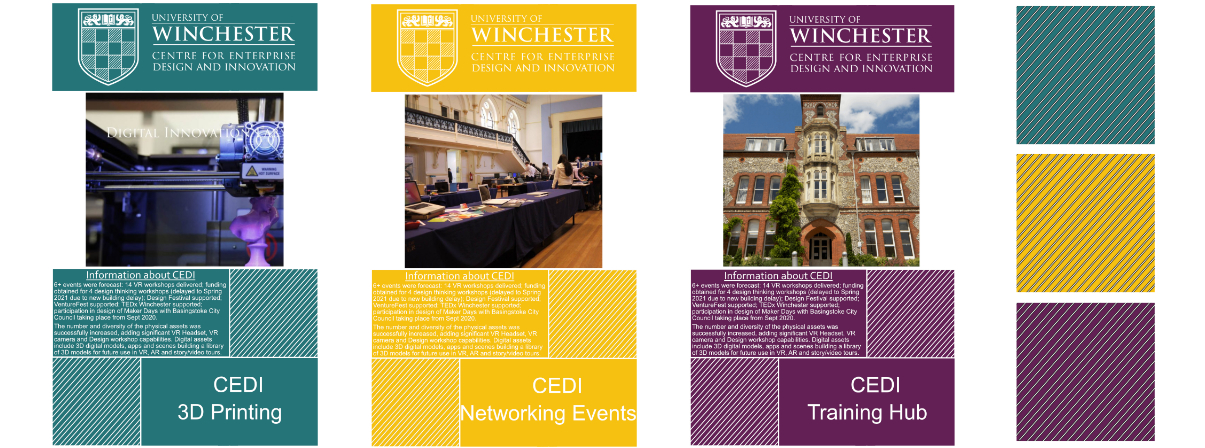
The cedi marketing material project needed to have leaflets that could be used to display information for each of the three departments in, 3D printing, Networking events and Training hub. Each of these had their own colour scheme to follow to make it clear to the use what they are looking at and when looking for content about that pacific topic. On the leaflet each of them provide a map of the University as well as information about cedi and contact information.
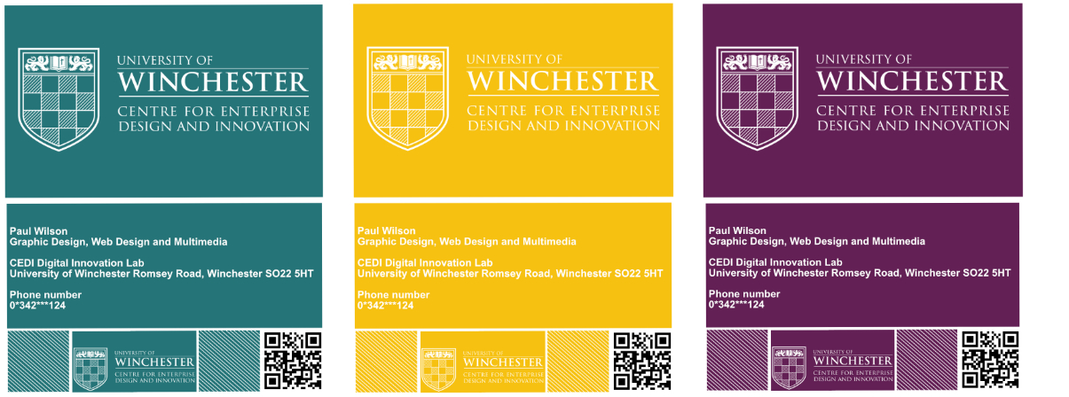
For the cedi business card the design of the front page with the logo had already been decided by the University of Winchester so it was my job to come up with a suitable back to the business card that would display contact information and a qr code. Each of the different departments have their own colour scheme to follow as well as their own unique qr code that allows the user to find out more information. The design had to follow the University of Winchester brand guidelines.
As for the design of the posters for the cedi project it was important to continue the theme of the three different colours into the cedi marketing material and make sure that it follows the brand guidelines set out by Winchester University. The posters need to have a clear unique image to represent its department as well as information about cedi and what it can offer. Bellow you can see the diagonal pattern that I have been using for the squares throughout the marketing material.
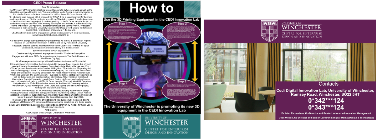
One of the requirements from the client brief was to create a press release document as well as a how to infographic. I also created a contacts page that would allow the user to easily contact someone if they wanted to find out more information. The press release document needed to look very simple and to the point. The logo is displayed at the top of the page and then the press release follows. As for the how to infographic it was important that the user could understand more about how a 3D printer works.
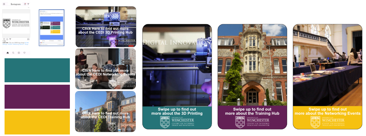
To help advertise the cedi departments social media content will need to be created. I needed to continue the theme of having a pacific colour scheme for each of the different departments. As for the first social media post an image of the logo would be presented. I also created what it would look like as an Instagram story with the different departments and include a swipe up feature allowing the user to find out more information about the different departments.
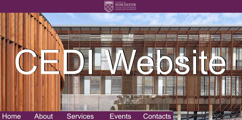
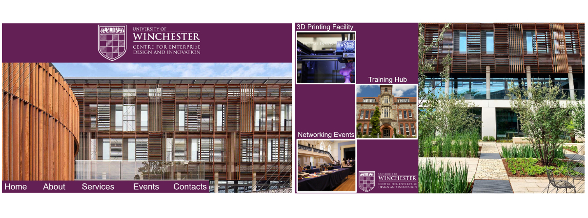
A new look cedi website also needed to be created for this project. I continued on with the theme from the University of Winchester brand guidelines and focused on purple for the colour to be used. I wanted the design of the cedi website to be simple and effective allowing images to show and engage the user to find out more about the University. A tab at the bottom of the page allows the user to find out more information and the second image shows the different departments that they can explore.
As part of my second semester for my third year I needed to come up with my own individual “paper project” that is made up in order to fulfil the negotiated design project NLT2 module assignment. This is a project that I wanted to take on in order to improve my Adobe Creative Skills for different software's as part of my NLT2. For this individual project I had to create my own brief to follow so that the brief and the brand guidelines could be take on for anyone that want to develop this project. This is to be designed to suit the target audience, with a professional look and feel for the application and functionality of the app. The app needs to attract new users that want to learn more about the sport that you have chosen. For the sport I decided to choose Golf as it allowed me to get creative with the golf course designs. From me choosing this project I have learnt new software’s such as Adobe XD and improved my knowledge of other adobe software's that professional companies will be using to create their work. Its important that I gain as much experience as possible with the Adobe Creative Cloud to support me in the digital industry. I was able to produce an application that functions well and a professional brand guidelines document for this paper project.
The first sketches that I did was to get ideas for what I was going to focus my paper project on. I started of by looking at what I included in my NLT2 study plan from last year and start to write down some key words that I wanted to focus on and learn. This allowed me to develop my mind map and start thinking about what I wanted to create and focus on. I came to the conclusion that I wanted to focus on learning new software such as Adobe XD. From this I could then create an app that would be on a sport that I am interested in. This then developed to a golf app that helps guide you around the different courses.
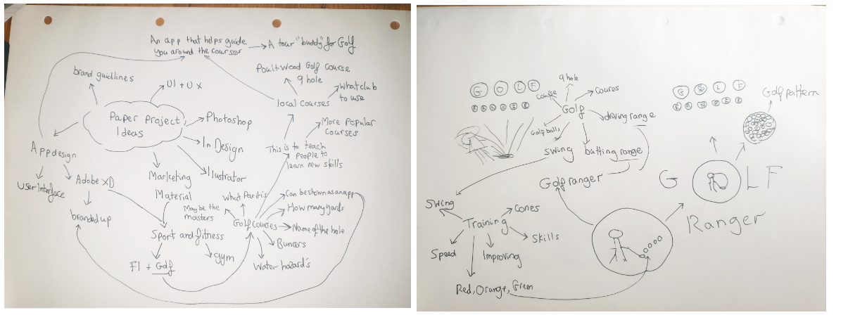
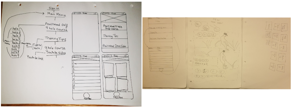
The second sketches that I did was to try and think about the layout of the application, the design of the logo and how the user will flow through the app regarding the navigation. The first image shown a plan of what the main menu page will look like and how it will be broken down into different sections. The other sketch is of the golf course page which will be broken down into the 9 holes and include a main menu button allowing the user to go back and access other information. The second page shown ruff sketches of the logo and the development of ideas to the outcome of Golf Ranger. The third page is a breakdown of how many pages will be included in the application.
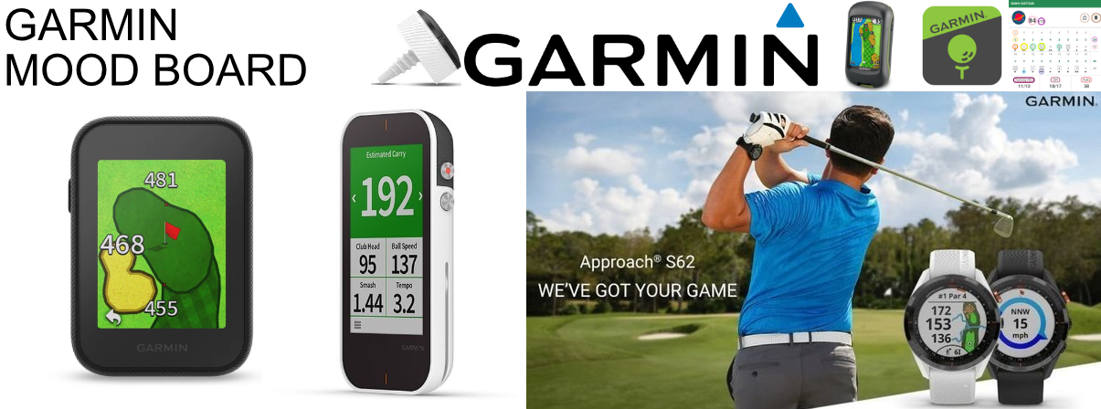
I first started of by researching examples of Garmin products that are used by golfers to help improve their skills. This allowed me to get a better understanding of the types of features that are included on the devices as well as how the information is presented to the user. I created a mood board to start think about ideas of what I wanted the application to look like and the types of colours that I would include.
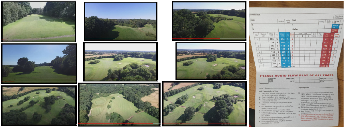
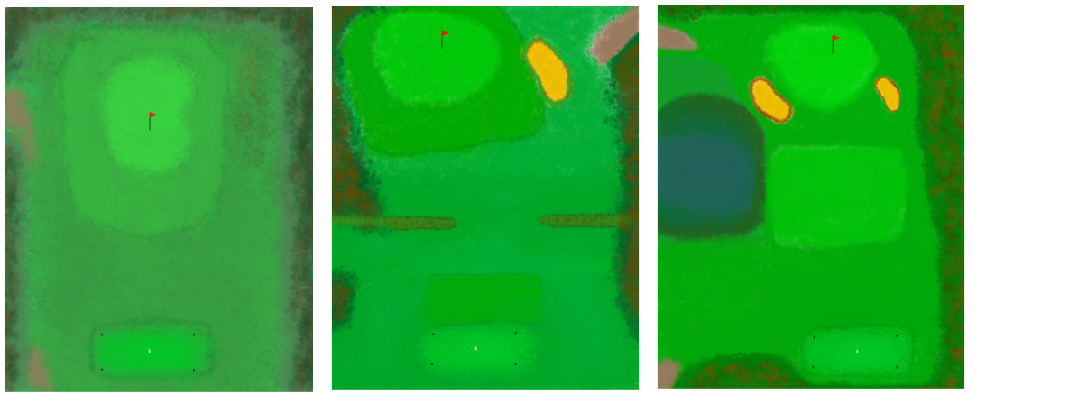
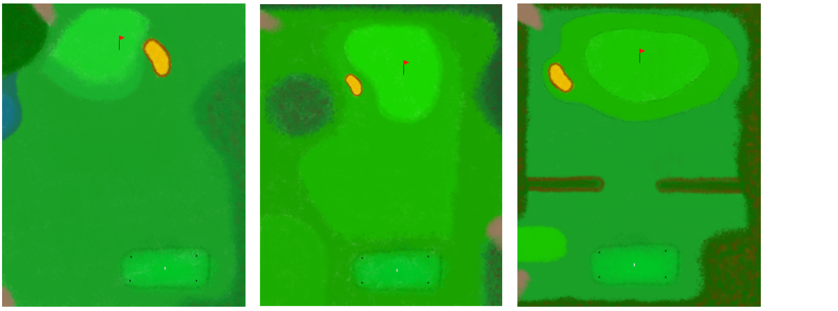
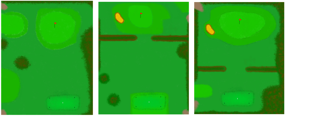
Tmactive who are the partners of the golf courses have lots of useful and helpful images of each of the courses from up high. This allowed me to understand the layout for each of the courses and how the golfers move from one hole to another. This provided me with great information when designing each of the golf courses. Not only did I have a good visual understanding of each of the courses, but I also knew the correct measurement for each of the courses. For this project I made more sense to choose a local course that I would have more knowledge in and that’s more accessible to beginner and new golfers. Therefore, I decided to not go down the root of golf courses like the Masters or the PGA Tour and chose a local course in the 9-hole Poult Wood Golf course. It was important to get the correct details for each of the holes that would be included in the app. This is the score card for the 9-hole Poult Wood Golf course. This was helpful for me when designing the application knowing that I had all the correct information for the user. The score card also includes all the basic rules of how to navigate around the course and their rules.
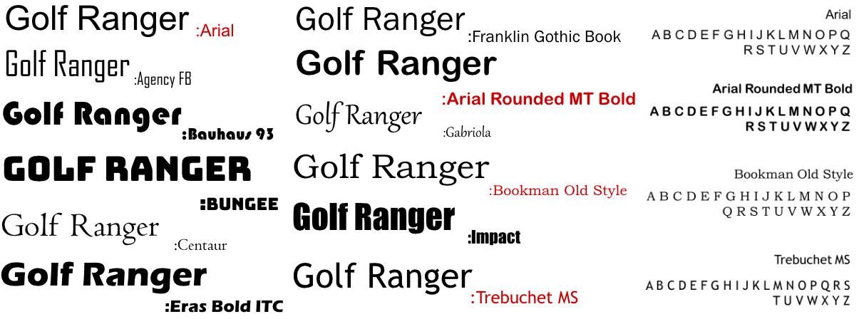
These at the fonts that are used in this project. Each font has its own purpose for being used. So other fonts should be used apart from the ones shown. The Arial font is used to display the text in the app which is part of the phone navigation display positioned at the top of the phone. The Arial Rounded MT Bold font is used to display text in the brand guidelines document as well as the font used for the logo in Golf Ranger. The Bookman Old Style font is used to display all the text and information in the app. This doesn’t include the logo in the app. The Trebuchet MS font is used to display the text used in the brief format with all the descriptions of the brief.
For the design of my first logo, I received some feedback to improve the design. I decided to get rid of the colour training pattern on the logo as it looks like traffic lights. I had to rethink this idea and try and make the O look more like a golf ball. From this research I decided to replace the three coloured golf balls with a motion swing and include a golf ball texture pattern over the top. For the first logo design is shown on the left and the new developed one is shown on the right.

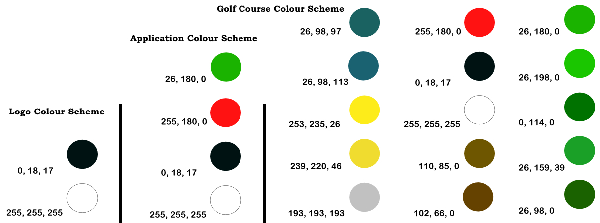
This is the colour scheme that has been used to create the logo. It only consist of black and white to help a simple but traditional brand identity. By only having two colours it allows the golf pattern design in the background to stand out more. There is a total of 4 different colours for the application which are also featured in the creation of the golf courses. This is to keep it consistent and have a theme that runs right across the brand. The details for the colours are shown to the right with the RGB HEX Codes shown alongside. This colour scheme only applies to the logo designs of each of the golf courses. The colour scheme consists of a total of 15 colours to ensure that there's a wide range of layer blending and contrasting colours. No text or images can overlap the design of each of the golf courses. These golf courses are included in the application. There is a total of 9 golf courses each with there own characteristics and design. However, they have only used the colours shown in the colour pallet. The details for the RGB HEX Codes are shown to the left. The colour scheme includes a lot of different types of greens to represent the different surfaces on a golf course and are include for applying layers.
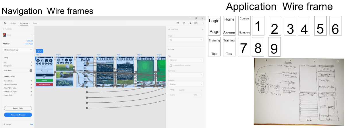
This is a very basic breakdown of each of the pages that will be included in the application. The user would be presented with a login and then a series of choses from the home screen. From there the user will be able to access some training tips to help improve their skills or get a visual and closer explanation of each of the courses of the 9-hole Poult Wood Golf course. From the course numbers page, the user will be able to choose from the 9 courses provided which one they would like to view. Once the user has selected that hole, they can then choose to view the next hole and other options with buttons presented bellow.The layout of the application must have a login page followed the main menu of the application. The main menu page allows the user to access different information that is broken down into interactive images. A separate page is provided to the user allowing them to choose which golf course hole number they would like to select. Another page provides training tips to help the user improve.
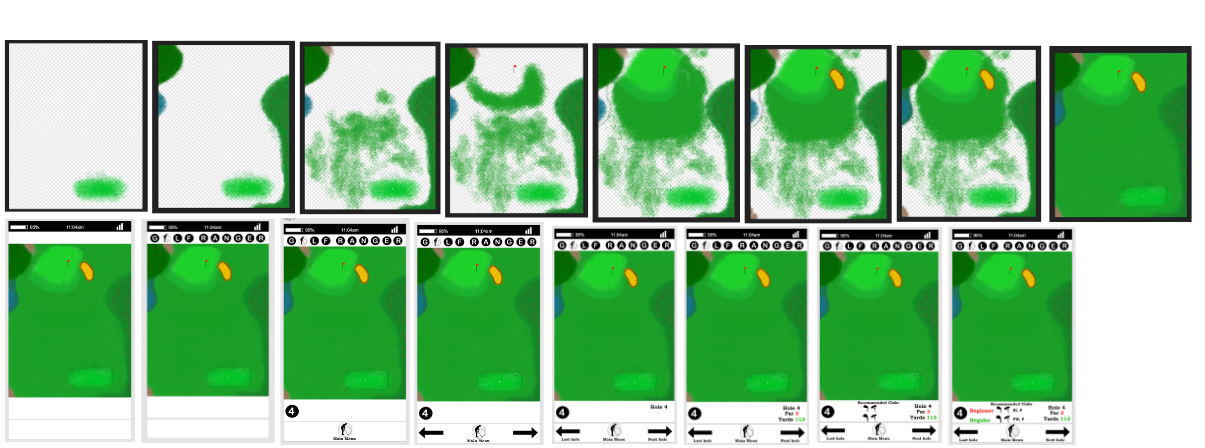
This is an example of the 4th hole which shows the developed of the design process for each of the different layers. The first developments are of the design of the 4th golf course and bellow is the developed of this presented in Adobe XD and the design development for what it looks like as an app. For the design of the golf courses a range of brush texture tools were used to create the diffrent layers.
The design of the first three golf courses.
The design of the fourth to sixth golf courses.
The design of the seventh to ninth golf courses.
This is the application that I have created which contains 14 pages. The link for this app is https://projects.animaapp.com/p/Xm6XVnH/bMHywHC/page-1/prototype?platform=xd.
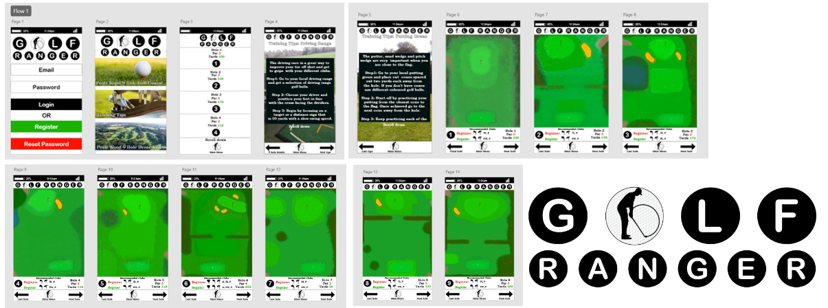
These are the design laws that I have taken insperation from when design for this paper project.
As a module assignment for my third year I was asked to produce evidence of attending networking events. For semester 1 I was asked to produce evidence that I had attended 3 networking events. I was then also asked to produce evidence that I have attended 3 networking events for semester 2. These networking events had to be completed online due to the pandemic. It was clear from this module assignment that they wanted us to explore our interests more in the digital world and learn from experienced professionals. I first started off by doing a lot of research into networking events that I could join. When I first started researching I came across that a lot of the networking events were very expensive to join. This is why I had to change my approach and look for free networking events that I could attend and most importantly be relevant to the digital industry that I wanted to go into after University. These were great opportunities for me to learn lots of information and a massive thank you to the hosts and presenters of each of the networking events. Each of the networking events are show bellow with the topic and what semester it happened in. Networking events are a great way to learn more about the digital world that we live in. I would also like to say a massive thank you the Thames Valley Chamber of Commerce Group for providing these networking events. It was unclear if these events were part of my assignment but I was still able to gain a lot of important knowledge for my digital career.
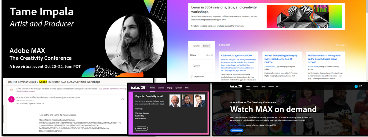
For this networking event hosted by Adobe Max which was hosted from the 20th October until the 22nd October I was able to learn a lot about the Adobe software’s via a teams calls. These teams calls were sent to my uni email and allowed me to access the link which is shown in the email bellow. This zoom call was a workshop that was hosted at 12 noon. The Adobe Max networking event had a lot of special guests including Tame Impala. He is a great artist and producer that offer a free virtual event. When I signed up to the Adobe Max event I was able to choose and search from a wide range of event which is shown in the colourful sessions image bellow. This allowed me to search for a key word which displayed what events were taking place. This was a great experience which allowed me to learn from top experts about the adobe software’s such as Illustrator, Photoshop and the principles to what makes a good design.
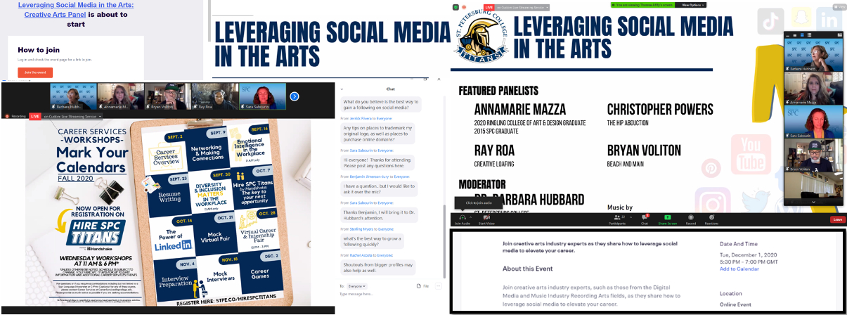
For this networking event hosted by St. Petersburg College which was hosted on the 1st December I was able to learn a lot how social media impacts people from different creative industries at different stages in their career. For example Ryan is an experienced Illustrator and Chris has his own music band. This zoom calls was sent to my email and provided a simple link which said how to join. This is shown in the image bellow with the orange bordered button. This zoom call was completely free and it had very experienced people that were able to give their opinions and views on all aspects of social media. We were able to ask questions in the chat and the judicator would ask the experts. This is shown in the image bellow with the chat open on the right. This was a great experienced that allowed me to understand the importance of social media from a wide range of different background information and their experience of how the digital media industry has changes over the years with social media.
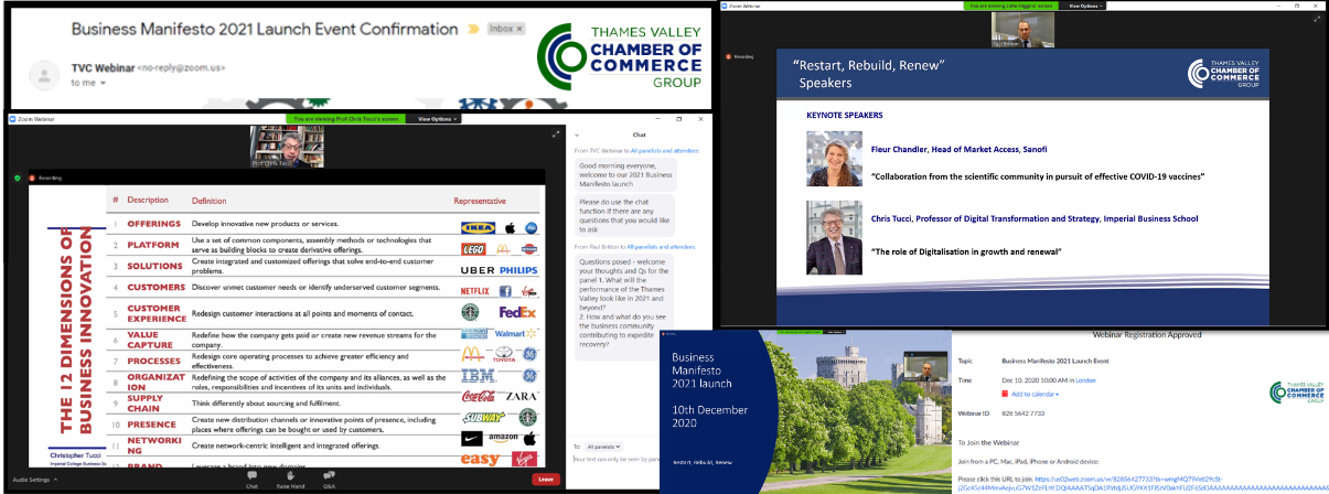
For this networking event hosted by Thames Valley, Chamber of commerce group which was hosted on the 10th December I was able to learn a lot about how brands are able to grow there ideas and the growth of technology. Chris Tucci who is a professor in digital transformation and strategy from Imperial Business School, was able to explain really well the importance of taking a chance on different technologies that the future is yet to show. This zoom call was sent to my email and provided a simple link which said how to join which is shown in the lower image. This was another great free zoom call that allowed me to learn the importance of trying to solve problems in the world instead of waiting for them to be solved. We were able to ask questions in the chat and the host would ask the experts the question. This is shown in the image bellow with the chat open on the right. This was a great experienced that allowed me to learn from top professionals in their related industry.
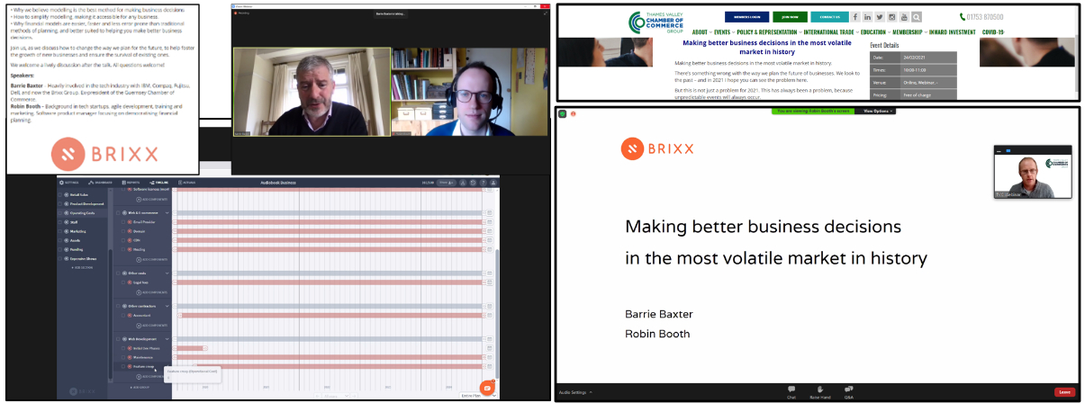
For this networking event hosted by Thames Valley, Chamber of commerce group which was hosted on the 24th February I was able to learn how to make better business decisions and the importance of having a plan that is update and that is flexible with dealing with the current market. This networking events is importance for me when consider if I want to start up my own business. Robin Booth worked for the Audiobook business which has been taken over by Amazon. He was able to explain how that business was ran with a break down of the costs of each of the departments. He was also able to explain the projection of the business and the risks that the business took and how it planned out. Barrie Baxter was able to give his own views of creating software that helped you manage and change costs to show different projections in a business. He was able to explain why human error is much higher in a spreadsheet form for a business and how much more easier it is to make adjustments using software online. This gives me a great overview if I am to set up my own business in the future.
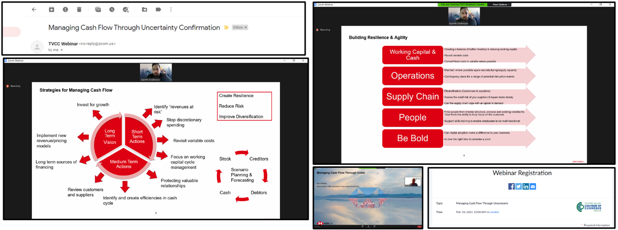
For this networking event hosted by Thames Valley, Chamber of commerce group which was hosted on the 10th March I was able to learn how to manage a business in how the market has changed and become more digital. This networking events is importance for me when consider if I want to start up my own business or work for a company. Gareth Anderson who works for the bank HSBC explained the importance of having a good relationship with your business. If the company has a good relationship with you they will stay it contact and provide support in challenging situations such as covid. He was also able to explain the importance of having different strategies when working in a business. For example cash flow projects and contingency plans. The importance of how a business manages its expenses. The growing increase in software and digital features is helping and support companies. It important to be more adaptable to change and un known situations. Its important for any business to keep asking why to insure that all areas and factors are considered.
For this networking event hosted by Thames Valley, Chamber of commerce group which was hosted on the 20th April I was able to learn the key steps to Internationalising Your Website. This networking event explained the importance of your website being available for different languages and why SEO is very important for your website presence. Claire Snowdon was able to explain her experiences of providing services for countries all over the world. Not all countries use Google as their main searching platform. However, it is the most used search platform across the world. She was also able to explain the importance of having a fully functional website that doesn’t have any broken links. This was the highest issue that the voting pole selected for what stops being from using someone's website. It was very interesting to see what countries spend most of their time on the internet and searching on sites. People want to find what they are looking for quickly on peoples websites and the word, trust is very important for a customer. Having a simple navigation bar that provides a drop down allowing the user to select the language they would like to view your website in.
